Project Name:
SmoorHouse
Type:
Cannabis Brand
Agency:
RORI Creative Hub
2025
SmoorHouse
A fantasy-inspired brand blending nature and imagination. Clean, playful visuals reflect a magical forest lab, designed for clarity, flexibility, and storytelling through every product.
Wordmark
Combination
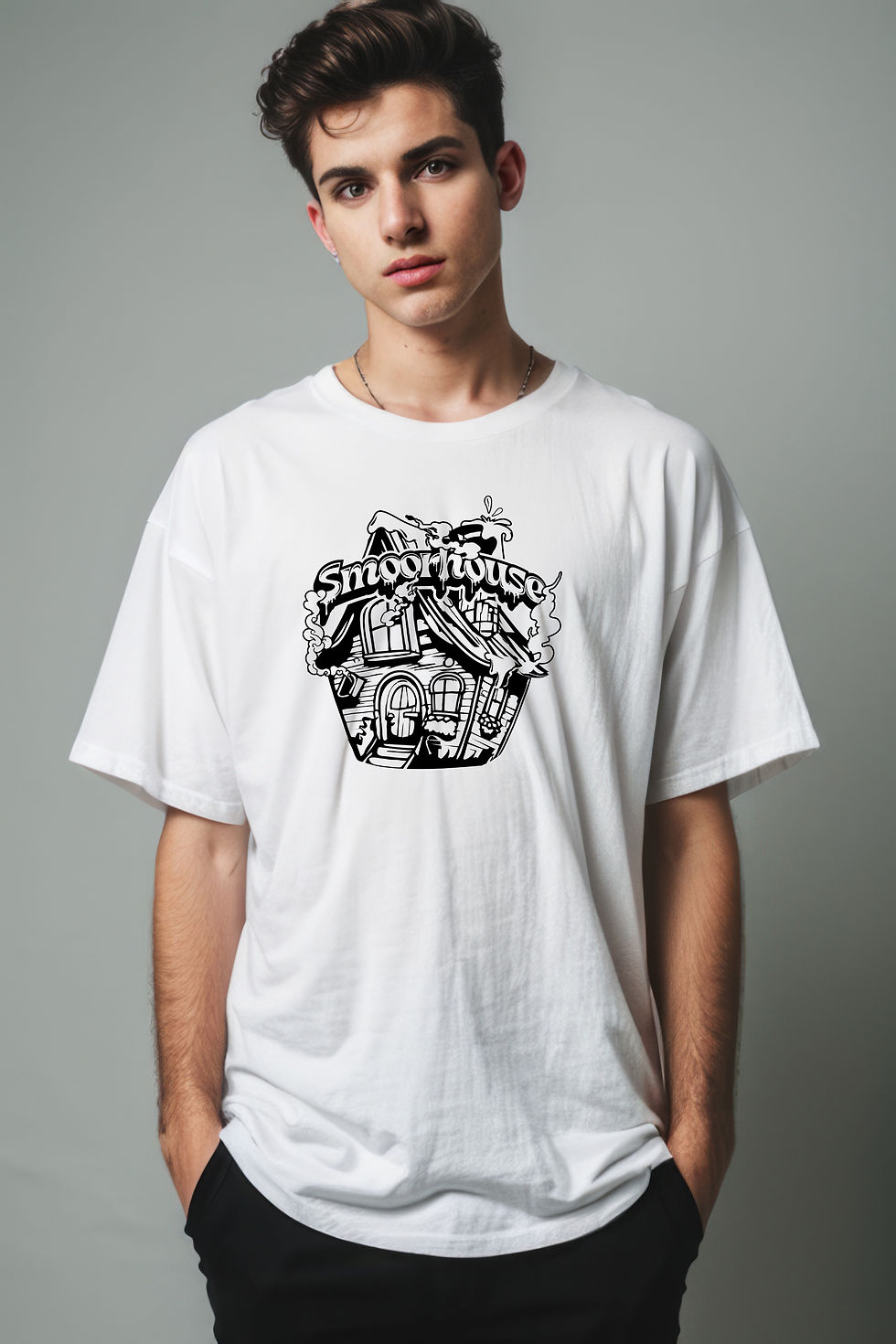
Logo Concept – SmoorHouse
The wordmark uses soft, flowing letterforms with smoke details to reflect a dreamy, mellow vibe. The combination mark features a whimsical, hand-drawn house — a symbol of the brand’s magical, story-driven universe.

Designed for flexibility, the SmoorHouse logo works across print, packaging, and merch — with variations for color, layout, and tone while keeping a consistent brand feel.


Strain Packaging
Each strain has its own color and illustration, making it easy to spot while keeping a strong, consistent brand look.


