Project Name:
Type:
Urban Mobility Project
Agency:
FOCUS AGENCY
Timeline:
2022
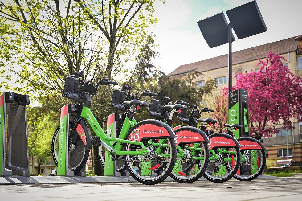
Sibiu Bike City is an urban mobility project featuring a modern bike-sharing system designed to promote eco-friendly transportation. The branding and visuals reflect a clean and dynamic identity that connects the city’s community with sustainable travel.
Infinity Bike Symbol
Hidden “S” for Sibiu
The logo uses an infinity symbol shaped like a bicycle to represent endless exploration, sustainability, and eco-friendly mobility.
Flipping the logo vertically reveals an “S,” a subtle reference to the city’s name that adds uniqueness and memorability.


A Fresh, Modern Identity
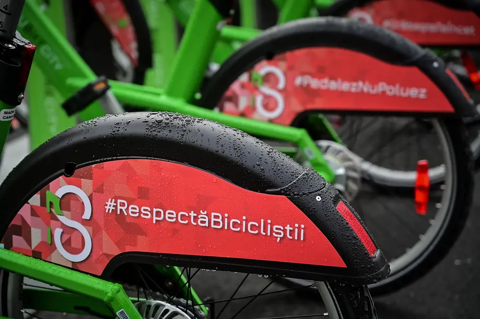
The visual identity uses green to emphasize sustainability and eco-friendliness, balanced with white for clarity and black for sophistication. Bold red accents bring energy and visibility to the branding across bicycles, stations, and signage.
Designed for Impact
The clean typography, dynamic layout, and vibrant palette make the branding stand out in the urban landscape, reinforcing Sibiu Bike City’s commitment to modern mobility and environmental awareness.


%20copy.jpg)